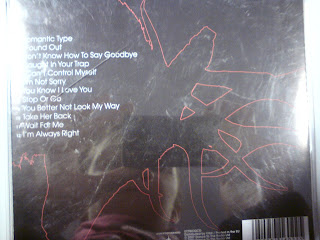
These four photos are of The Pigeon Detectives album Wait For Me.
The image theme of the album is dears. They are present within every image on the digipak, this animal imagery is very common within indie music. Indie tends to relate to nature. They don't play on materialistic elements like in pop and r n b. Indie tends to portray working class, average lifestyles in their music and this is closer to nature. This is why it is appropriate to have a dear on the front of the album because it makes sense for the genre. The two dear on the front are locking horns, it looks gentle and loving which could evoke the love side of the songs, however locking horns is usually an action of aggression so this could be the pain of loss of love shown in the songs. The black and red makes the album look dramatic and strong. However the white on the front cover reminds us its an indie genre. The font is simplistic which goes with the way of their music. Which is simple but creative, it makes the band seem more sophisticated because there is no childishness to the font. However it is bold and simple which is an indie convention. The image sells the artist as a mature band with meaning to their music however elegance and natural beauty is also shown through the use of a dear. The animal imagery creates a light hearted feel reminding the audience once again of the genre.
These four images are of The Maccabees Album Colour It In.
The digipak is very appropriate for the genre. They have chosen odd characters to be represented on the front and different colours. They have however challenged a convention of bright colours in indie imagery by choosing mint green and brown. This however works in making the imagery more obscure and is therefore very inviting to an audience of this genre. The images of the characters makes the audience think how society may be portrayed to the band. How everyone is odd in their own way. Indie conventionally plays on oddness. The mise-en-scene gives the impression that the band are funa nd lighthearted in their music. They want to make people laugh rather than necessarily be taken 100% seriously. It also makes the audience feel as though people are lost in society and that this album is based on people and their lives. The back photo at the top is black and the images seem imposing, this possibly portrays the darker side of society. The inside cover is like someone standing in a street with a walking advertisement and the front is a crowd. The mise-en-scene suggests the everything to do with society and people as individuals. This gives the effect of the audience being a part of the album because it is about themselves. The images sells the artist as a meaningful but fun band. As a band that breaks slightly away from the conventions of indie to be their own. The curly font creates a childish and friendly feel to the cd making it more evident as an indie album.
These four images are of The Magic Numbers album. The are a rock indie band.
The digipak is extremely appropriate for this type of genre, they have the serious element of rock with the photo of the four band members all dressed in black, a conventional colour for rock. However they keep the indie conventions with the photos of the blocks on the back page and the cartoon people on the cd. The digipak images are very simplistic giving a mature feel to the whole album and this is strengthened more by the birds eye view photo of the band. The whole album gives the feel of an older indie rock band who take a serious approach to the genre. The shapes used are straight forward and neutral again giving the same impression. The image sells the band to those who are looking for something a little more serious than traditional indie. The font is basic in either black or white and in what looks like times new roman. This once again gives the audience the idea that this band is more mature and take a less light hearted feel.
Written By Jade Shepherd


No comments:
Post a Comment